Karri & Vine
Project Scope: Brand Identity & Experiential Design
Industry: Hospitality/Food & Beverage
Completion Date: 03.2025

Creative direction for Karri & Vine. This project focused on developing a compelling brand identity translated across every interaction to create an immersive brand experience. ED designed the brand’s identity, as well as the brand’s physical experience through packaging design and spatial design. This project was inspired by ED’s personal experience living in Margaret River and the six months she spent working on a vineyard to learn about wine making.
Design Concept
Wine making is intricately connected with its direct environment, from the nuances of each season to the habitat that surrounds the vines. The same statement can be said of the day to day rhythm of life Margaret River, the base for Karri & Vine wines. This is where the brand’s concept, intertwined, found its roots, inspired by a communion with nature and the breathtaking natural environment of the Margaret River region.
Visual Identity
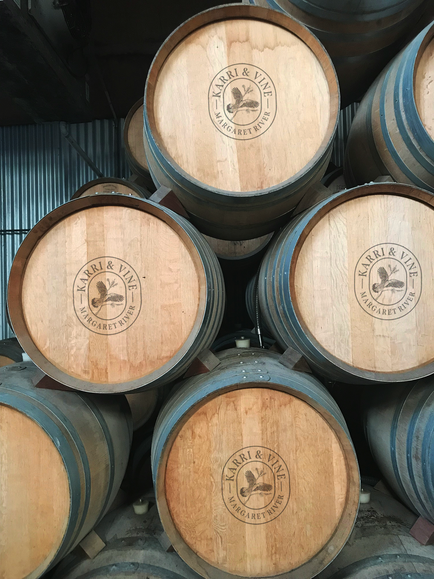
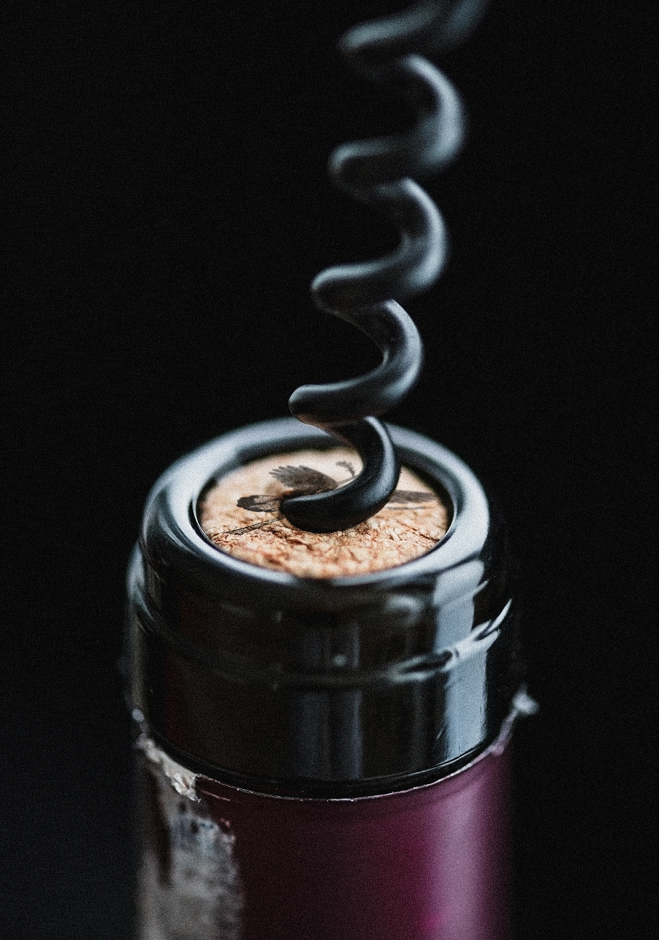
The Red Tailed Cockatoo is an iconic and endangered bird that is endemic to the South West of Australia. The bird nests in eucalyptus trees, such as the Karri’s, and are quintessentially Margaret River. Karri & Vine’s logo features a hand illustration of this bird, taking flight from a eucalyptus branch, becoming the first point of reference to the brand’s connection the its environment and physical location.


Colour Palette
Reinforcing the concept, the colour palette was derived from colours found throughout region’s landscapes.


Label Design
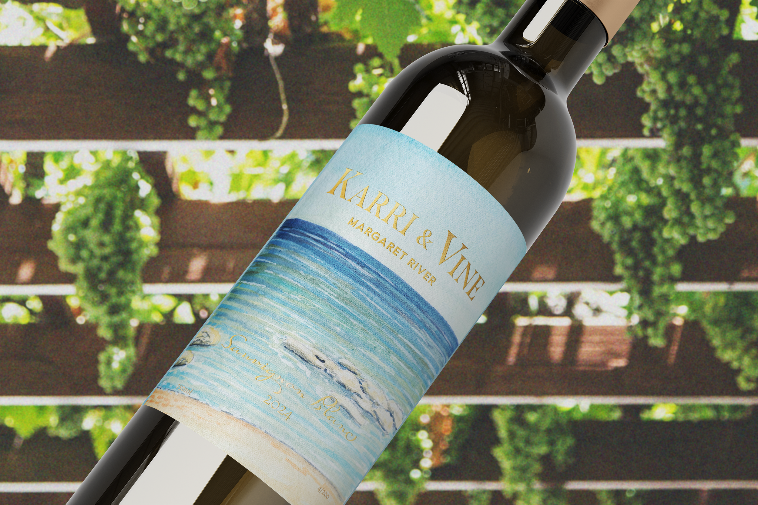
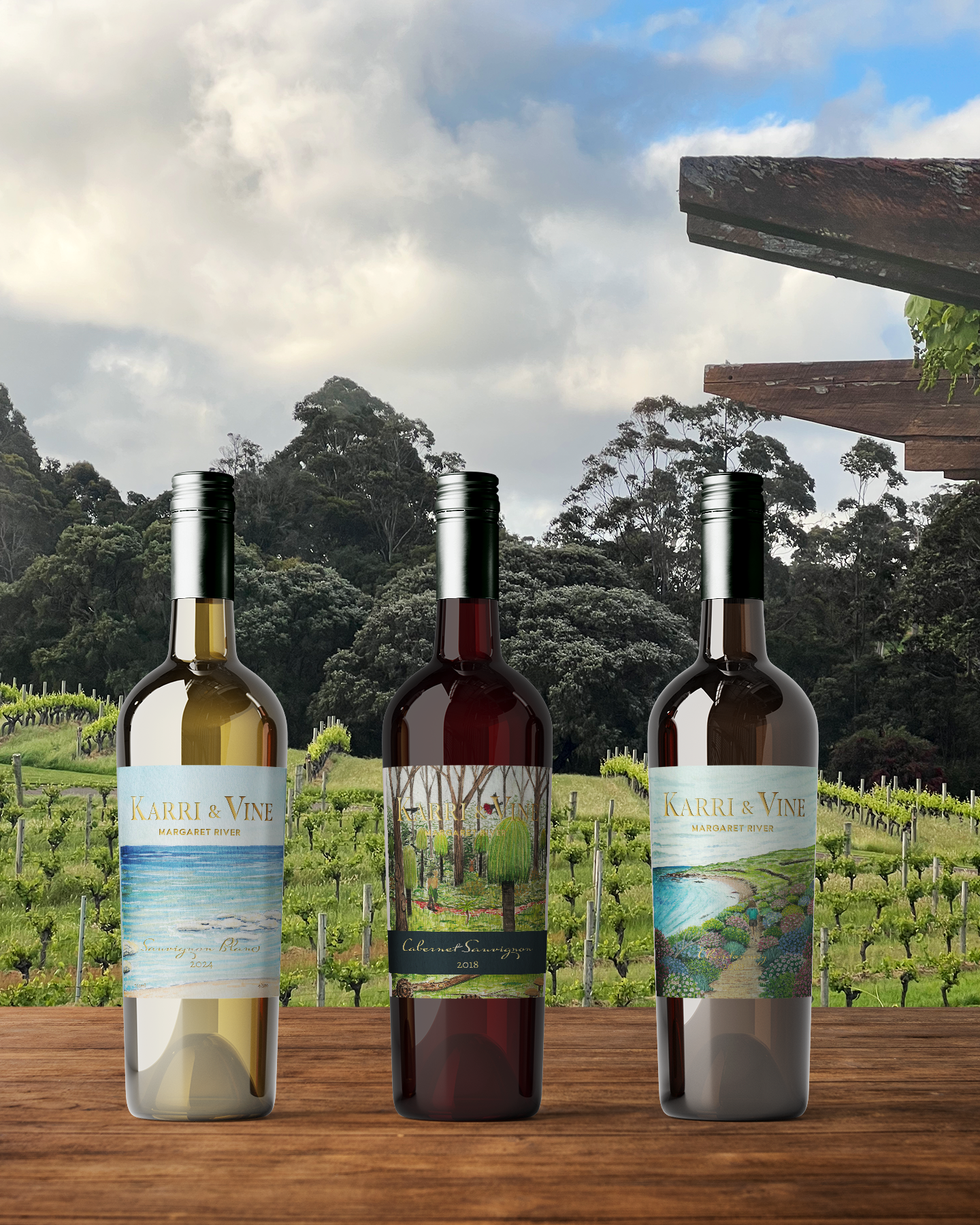
The labels designed for each wine are adorned with custom paintings created by ED featuring different scenes from around Margaret River. The complexity of each painting correlates to the complexity of each specified wine. A gentle scene indicates an easy drinking wine, whereas a painting with more details indicate that the wine has a more layered and complex profile. The descriptions below explore this relationship in further detail.


A simple and soothing beach scene for the Sauvignon Blanc. This wine is light, crisp and fruit forward for easy drinking.

A blooming coastal illustration pairs with the vineyard’s signature Chardonnay, a savoury wine with a rich, layered profile.

A dense bush featuring various native flora and fauna represents the Cabernet Sauvignon which is a complex and full bodied wine.
Spatial Expereinces
The intertwined concept was carried into the brand’s spatial design. Custom signage, laser cut from bronze plates, were designed for the cellar door and restaurants wayfinding. These feature highly intentional details, such as the male and female cockatoo feathers used on the bathroom doors. ED also created some preliminary designs for a sculptural light fixture constructed from the vineyard’s recycled wine bottles and reclaimed wood. This could become a celebrated piece within the brand’s physical space.


Brand Pattern
This hand illustrated pattern was custom designed for Karri & Vine to be utilized in print within their interior spaces and brand collateral. ED intentions for this pattern include for use as a wall paper, custom textiles for seating and assets such as printed packing tape and tissue paper.


Design Process
ED’s design process focuses on exploring experiential moments. This is a design method that originated in architectural practices, called vignettes. It’s in these small moments that a brand and place create memories and experiences. Karri & Vine’s brand design can be considered as a collection of these moments, each informed by one another to evoke a cohesive total identity.


