The Fieldhouse
Project Scope: Brand Strategy + Design (Branding + Web Design/Build)
Industry: Non-Profit Organization
Completion Date: 02.2026
Team: Delalonde Studio
Branding + web design for The Fieldhouse, a non-profit based in Minnesota. The Fieldhouse is on a mission to solve a big problem with a simple solution, saving produce too odd for the shelves and redistributing it to their neighbours in need. They believe that in hard times we must always look for the helpers and now with their playful branding, the helpers are much easier to spot!
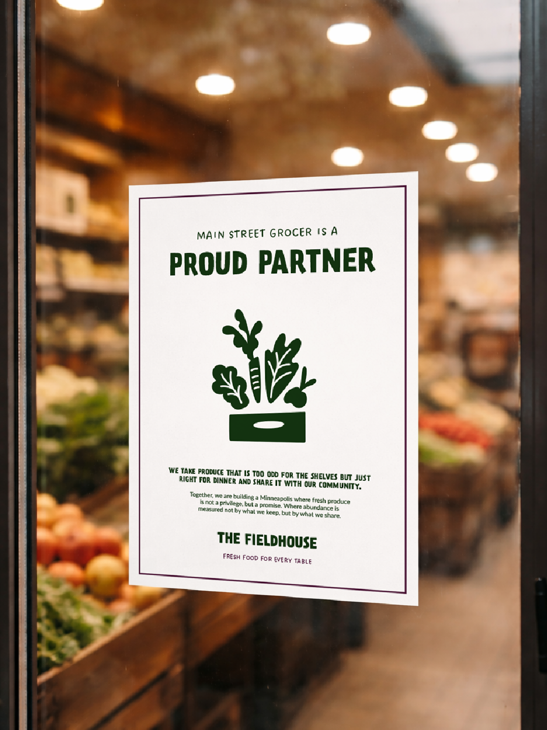
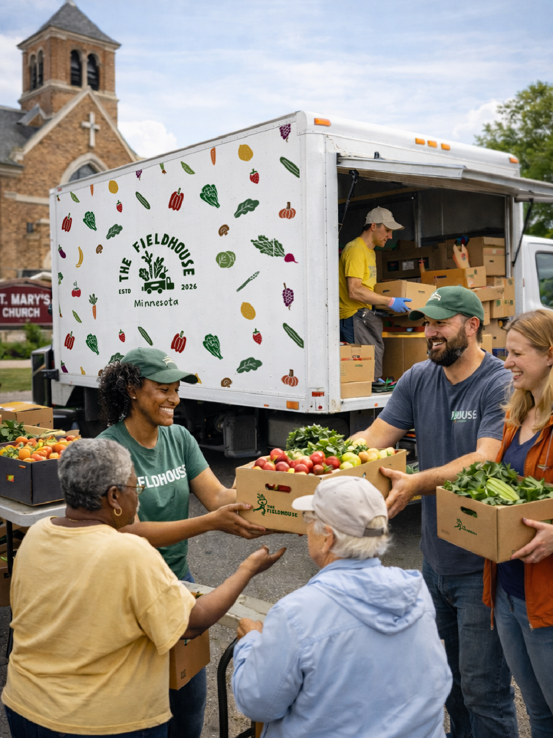
Step One: DefineMeet the fieldhouse
The Fieldhouse is a registered not-for-profit based in Minnesota. They rescue produce too odd for the shelves but just right for dinner and reroute it to their neighbours in need. Operating like a bookmobile for food, their fleet delivers foundational, nourishing produce through local distribution sites.
Step two: strategyIndustry research + concepts
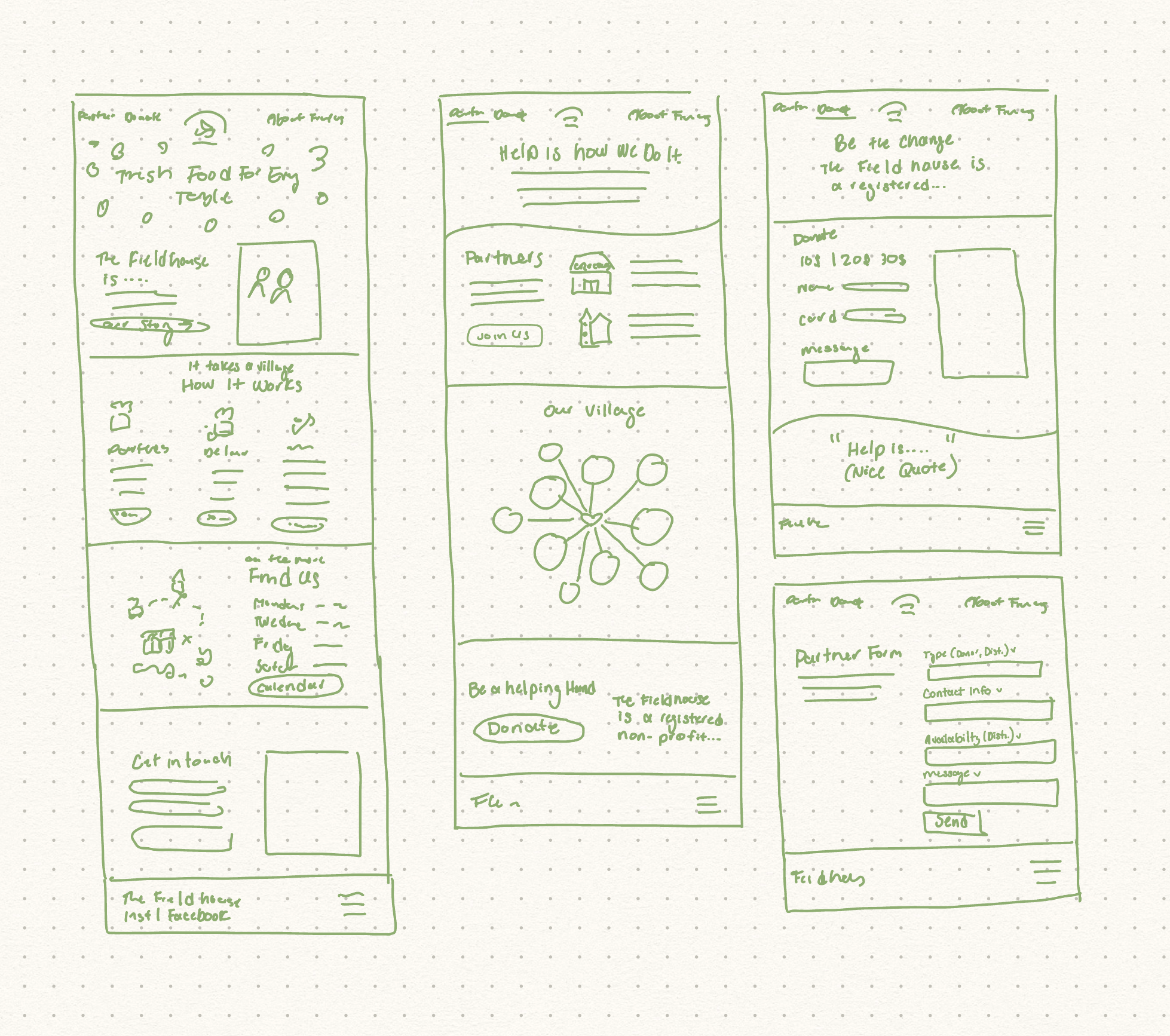
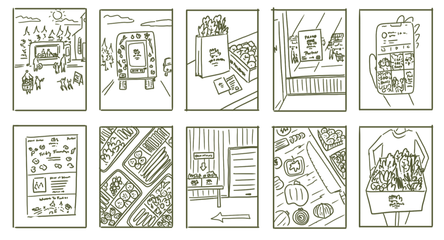
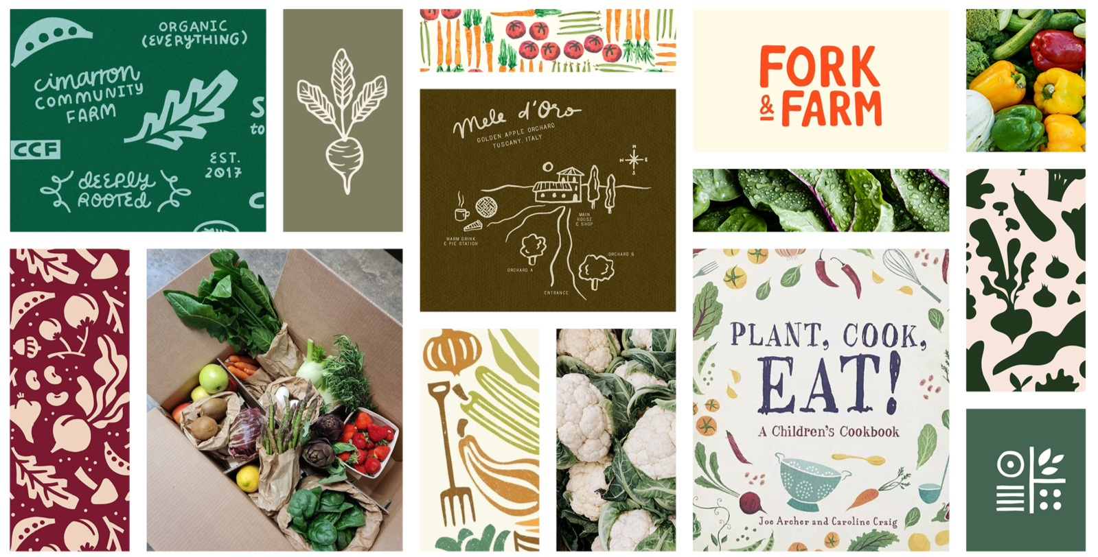
Before diving into the brand’s design, we developed the brand strategy. We conducted industry research, identified key stakeholders and explored early ideas through quick, iterative sketches.
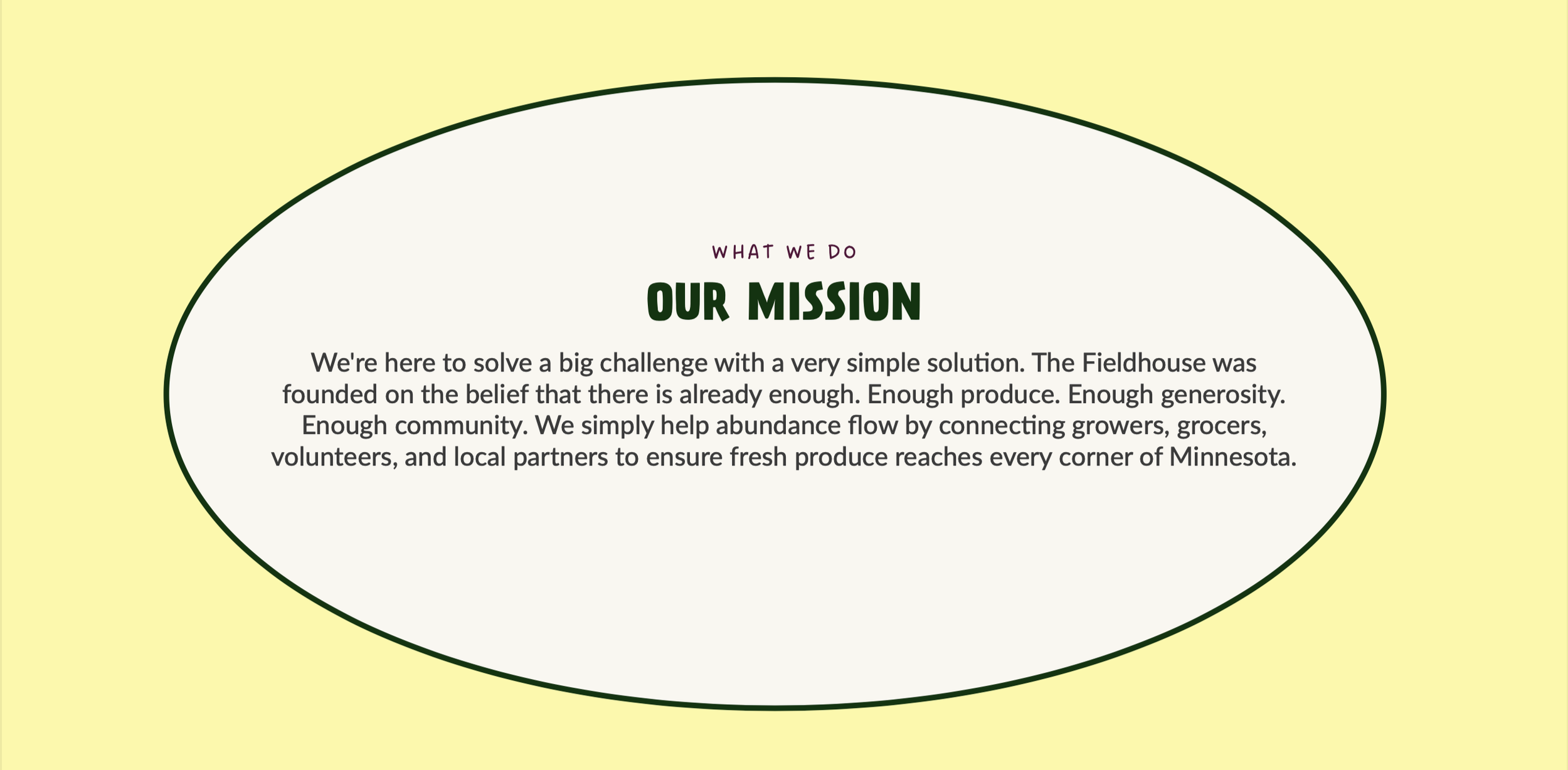
As a grassroots organization, the objective was to translate The Fieldhouse’s story into an inclusive identity grounded in the belief that providing access to fresh food while reducing unnecessary waste is a simple and obvious path to a healthier, happier community.
Key Terms:Approachable, educational, playful, youthful + witty
Moodboard + sketches: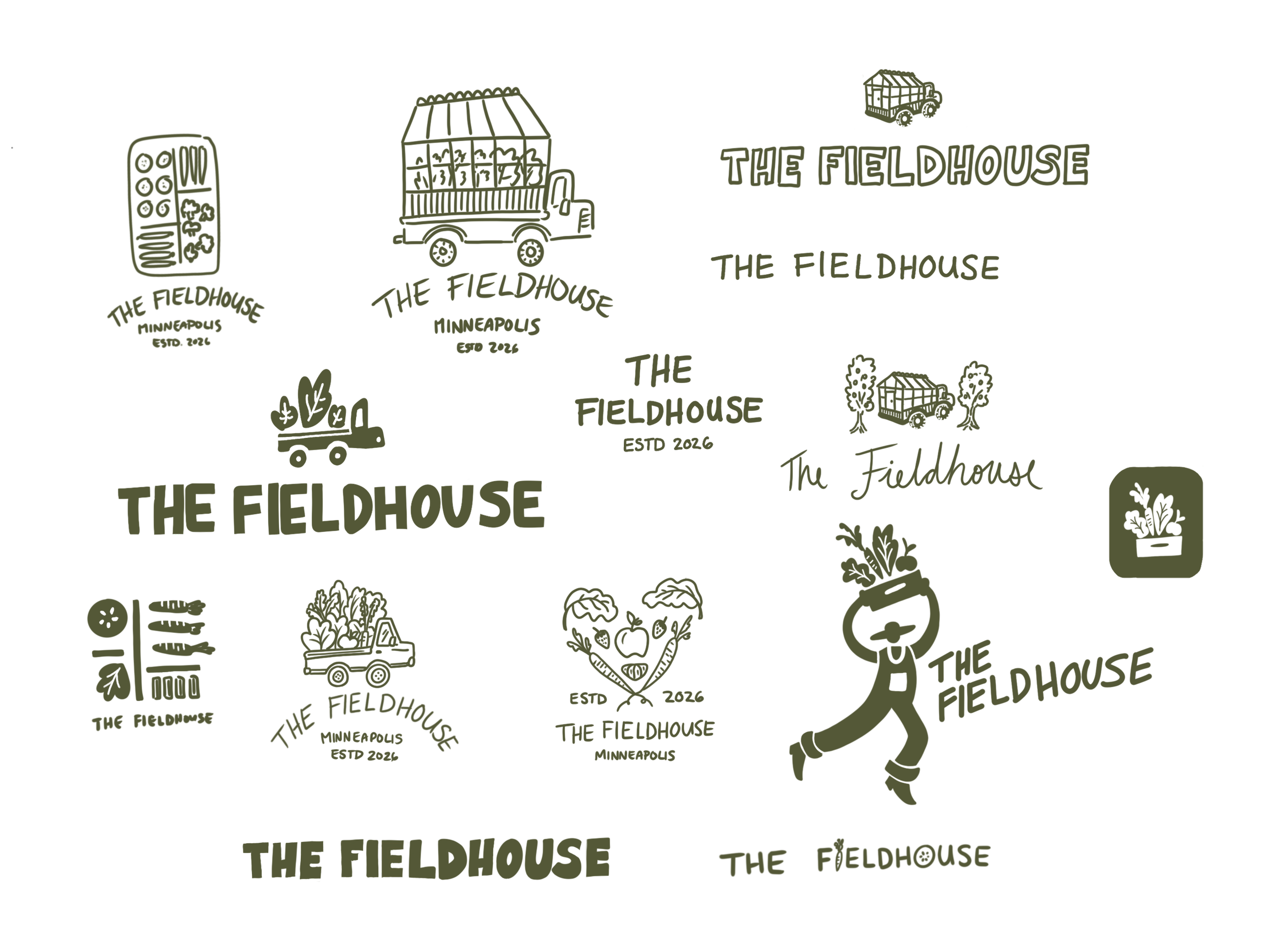
Step three: designbrand identity development
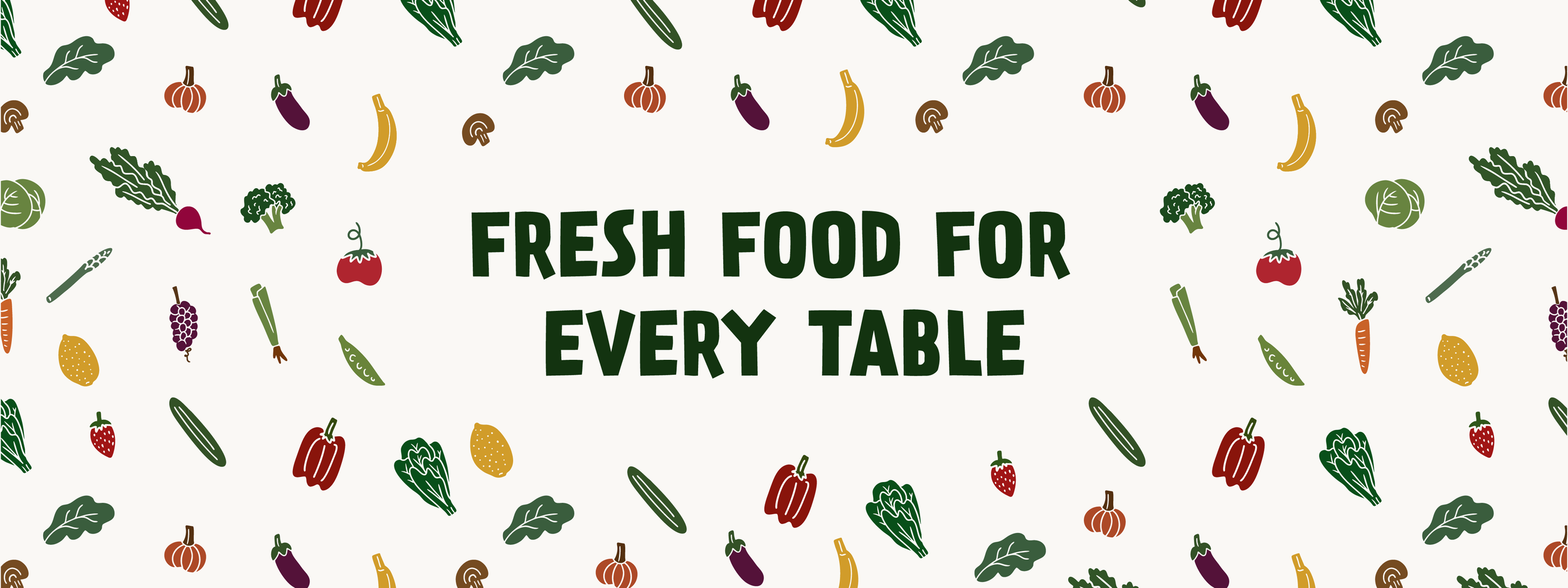
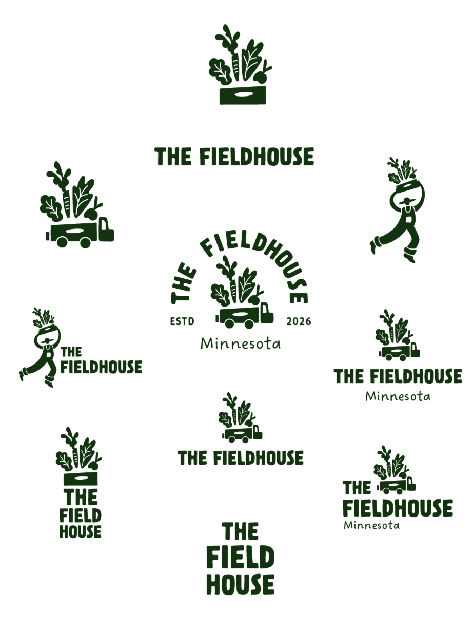
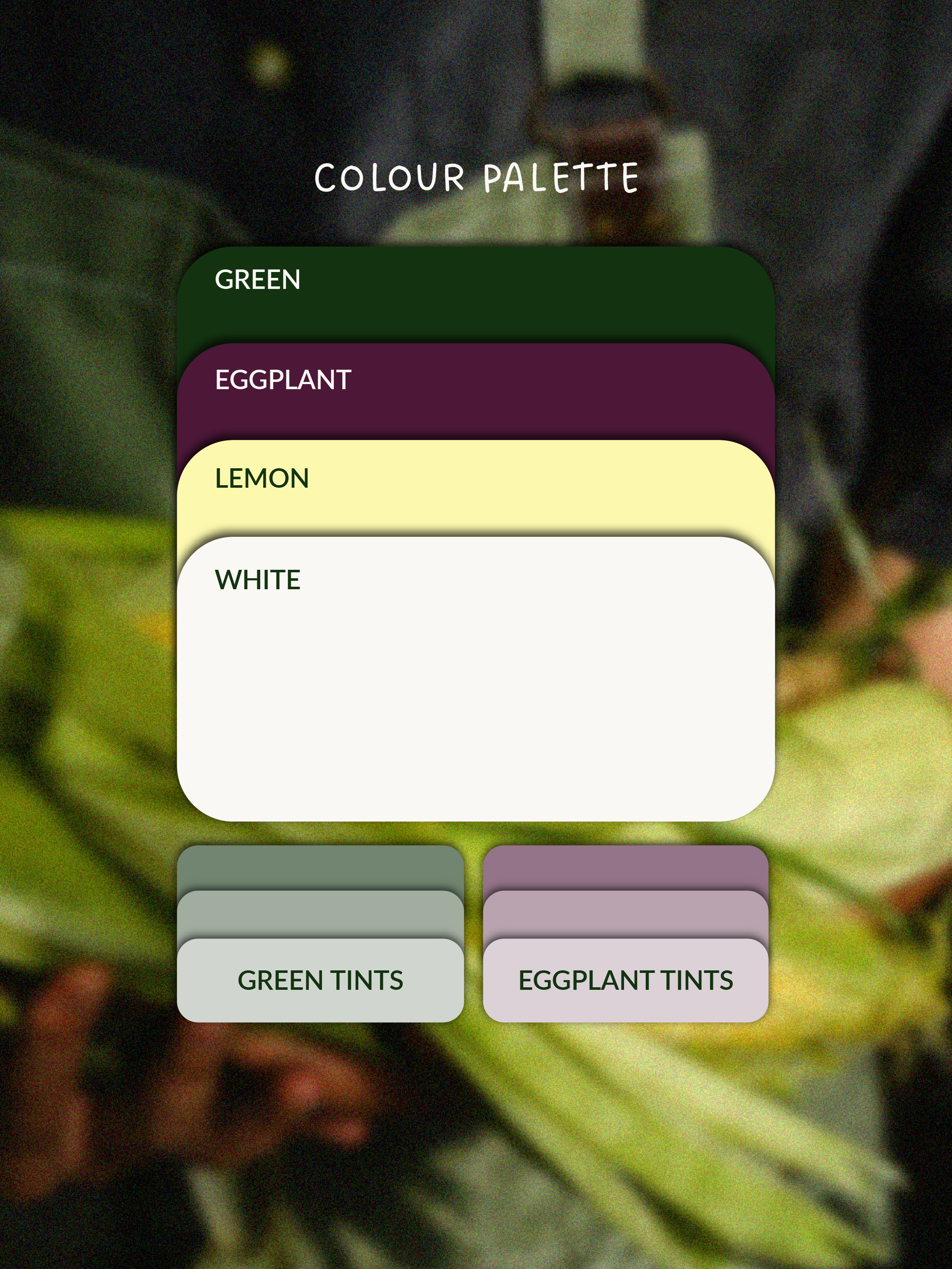
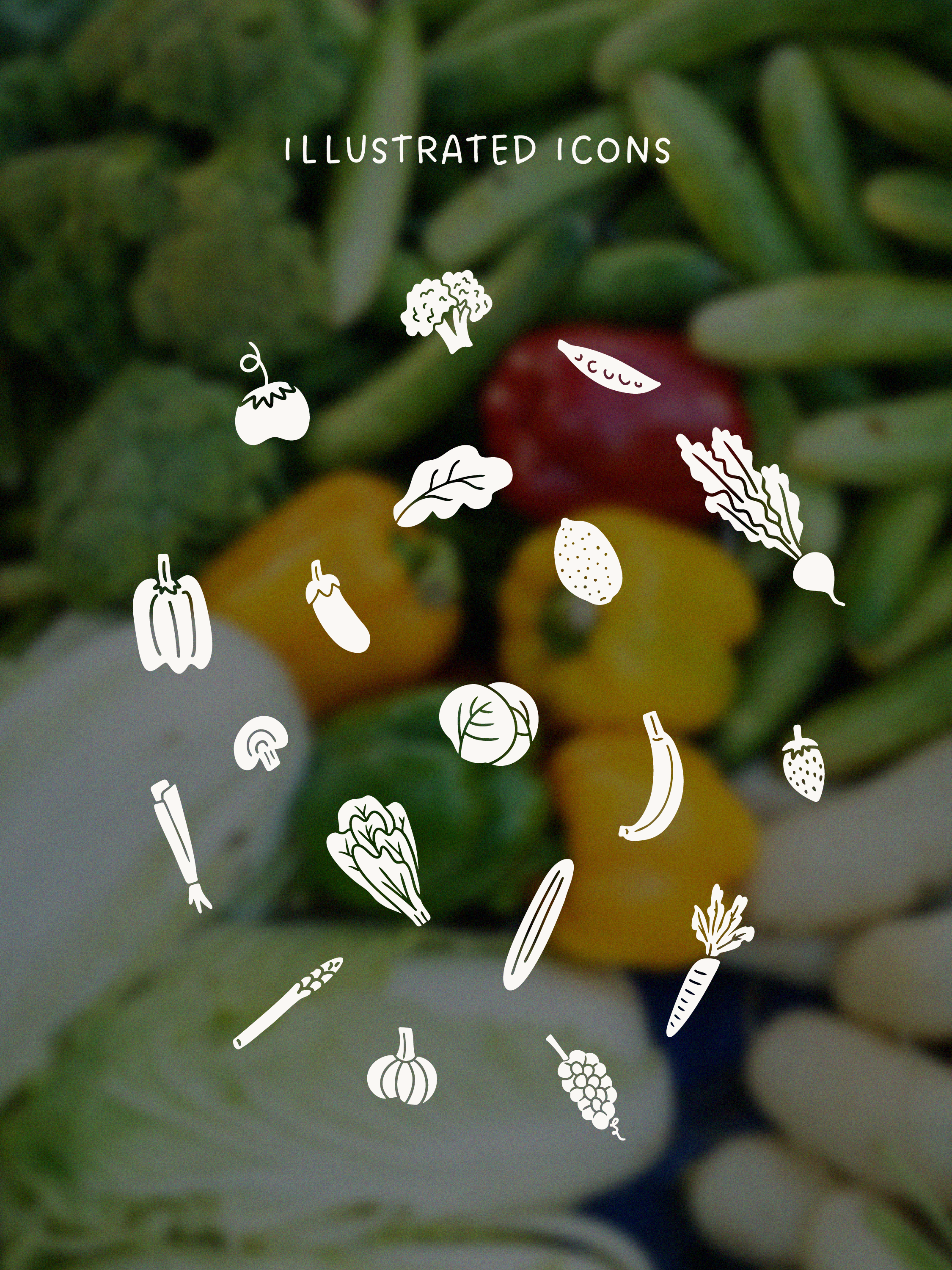
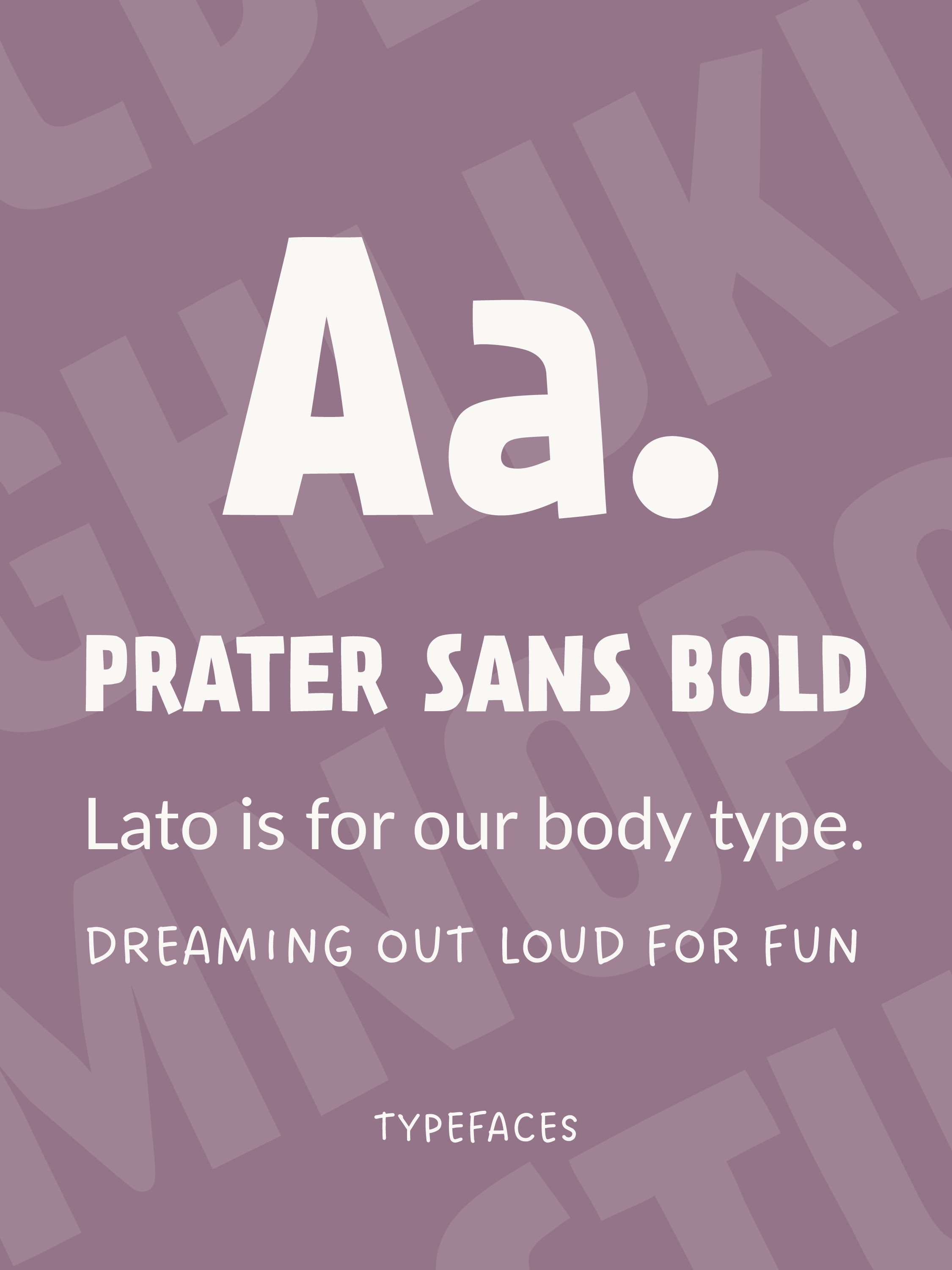
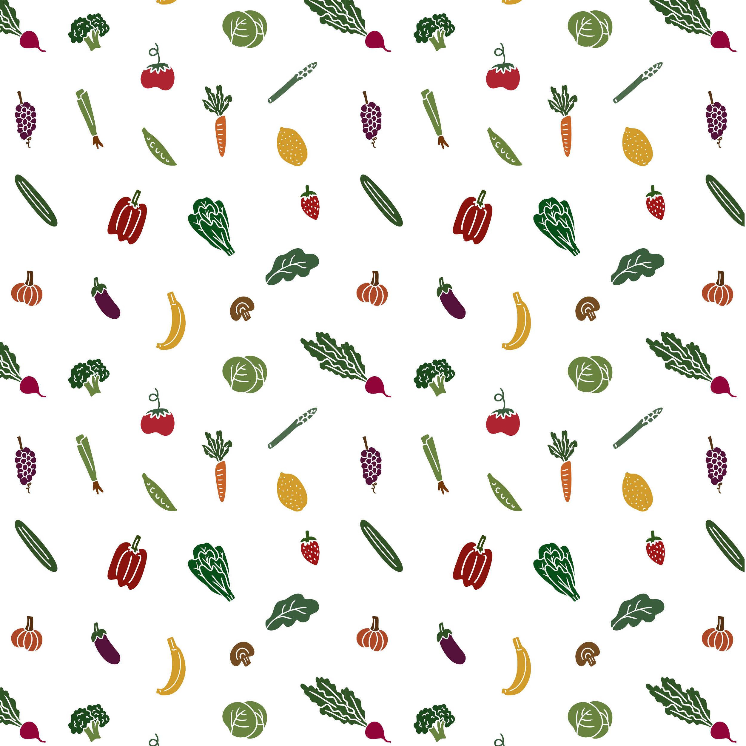
For The Fieldhouse’s brand identity, we worked collaboratively to design the brand across all fronts, from their visual identity to the brand’s written communications. The final identity is all about celebrating The Fieldhouse helps produce move within their community. The visual identity includes a comprehensive logo suite, brand typefaces, colour palette , custom icons and an illustrated brand pattern.
How Produce Moves
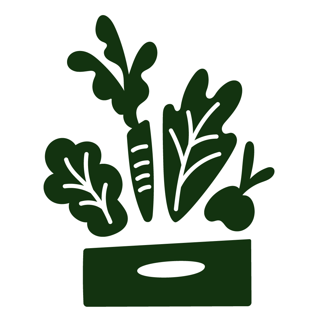
Suppliers
The growers, grocers, and food suppliers who give excess fresh produce a second chance through their donations.
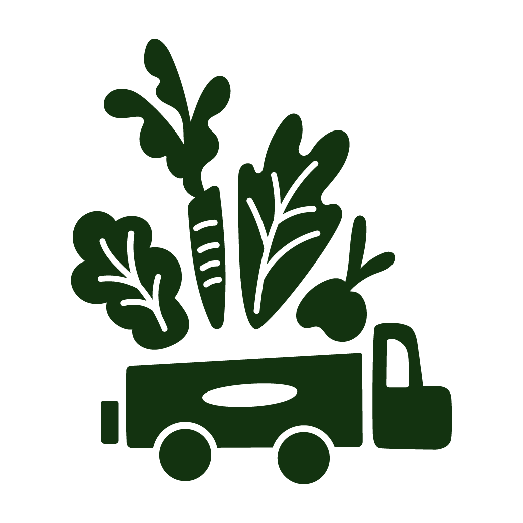
Local Hosts
From farms to parking lots to congregations, hosts provide welcoming places where food can land and people can gather.
Neighbours
The people at the heart of the mission. Neighbours show up, share stories, and bring these boxes to life in their kitchens and homes.

Brand Personality
APPROACHABLE
"Too much good food gets tossed for the wrong reasons. We make sure it ends up in the right hands."
EDUCATIONAL
"When grocery stores have extra produce they can’t sell, we pick it up and move it to families who can use it."
PLAYFUL
"Crooked carrots just have more character."
YOUTHFUL
"We’re rolling through the neighborhood with fresh produce, we’ll see you at 112 Elmer Road!"
WITTY
"Too odd for the store shelves. Just right for dinner."
Step four: Brand Rolloutweb design + build
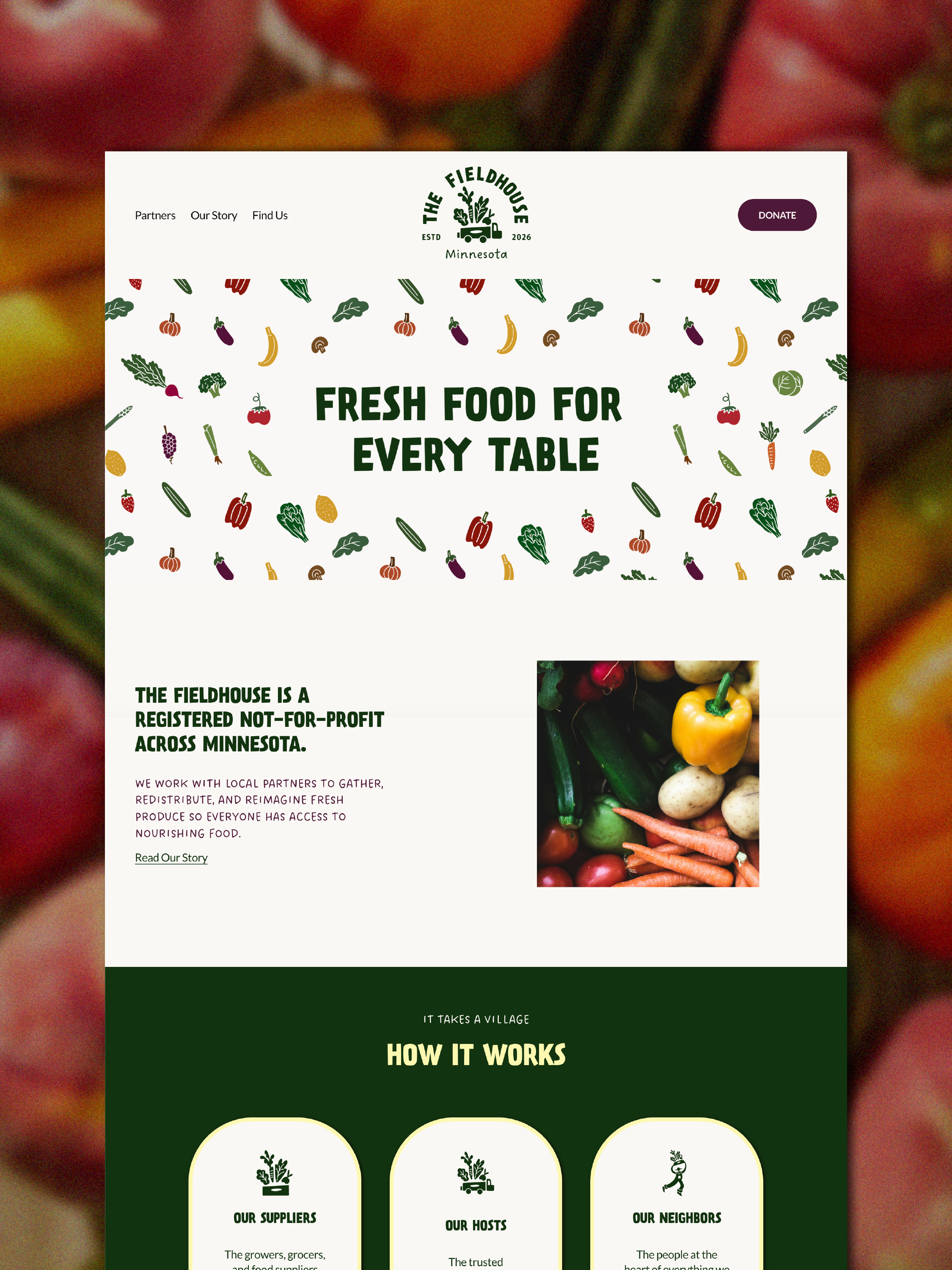
To help The Fieldhouse hit the ground running, we designed and built their website. The design, copy and narrative continues to develop the brand’s identity through content that balances playfulness with ease of navigation. The site includes an interactive calendar, donation integrations and contact forms for various stakeholders.
The live site can be accessed here.