The Fieldhouse
Project Scope: Brand Launch (Branding + Web Design/Build)
Industry: Non-Profit
Completion Date: 02.2026
Branding + web design for The Fieldhouse, a non-profit based in Minnesota. For this project we develop the organization’s complete brand identity, including their positioning, tone, personality and a visual identity along with a custom built website.
The Fieldhouse is on a mission to solve a big problem with a simple solution, saving produce too odd for the shelves and redistributing it to their neighbours in need. They believe that in hard times we must always look for the helpers and now with their playful branding, the helpers are much easier to spot!
Step One: DefineMeet the fieldhouse
The Fieldhouse is a registered not-for-profit based in Minnesota. They rescue produce too odd for the shelves but just right for dinner and reroute it to their neighbours in need. Operating like a bookmobile for food, their fleet delivers foundational, nourishing produce through local distribution sites.
Step two: strategyIndustry research + concepts
Before diving into the brand’s design, we conducted industry research, identified key stakeholders and established goals to guide the project.
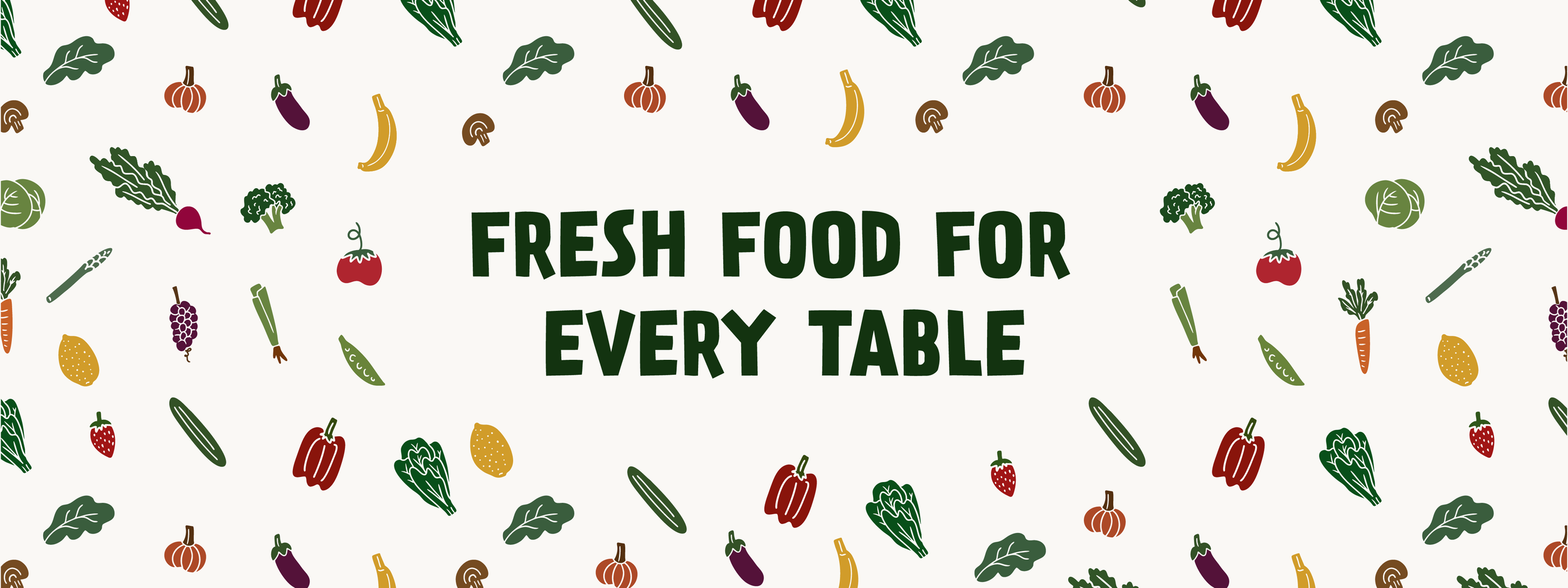
The ultimate objective was to translate The Fieldhouse’s story into a visual identity and brand personality that felt light, approachable, and intentionally non-corporate. As a grassroots organization, our priority was to create a brand that was inclusive and grounded in the belief that providing access to fresh food while reducing unnecessary waste is a simple and obvious path to a healthier, happier community.
Positioning: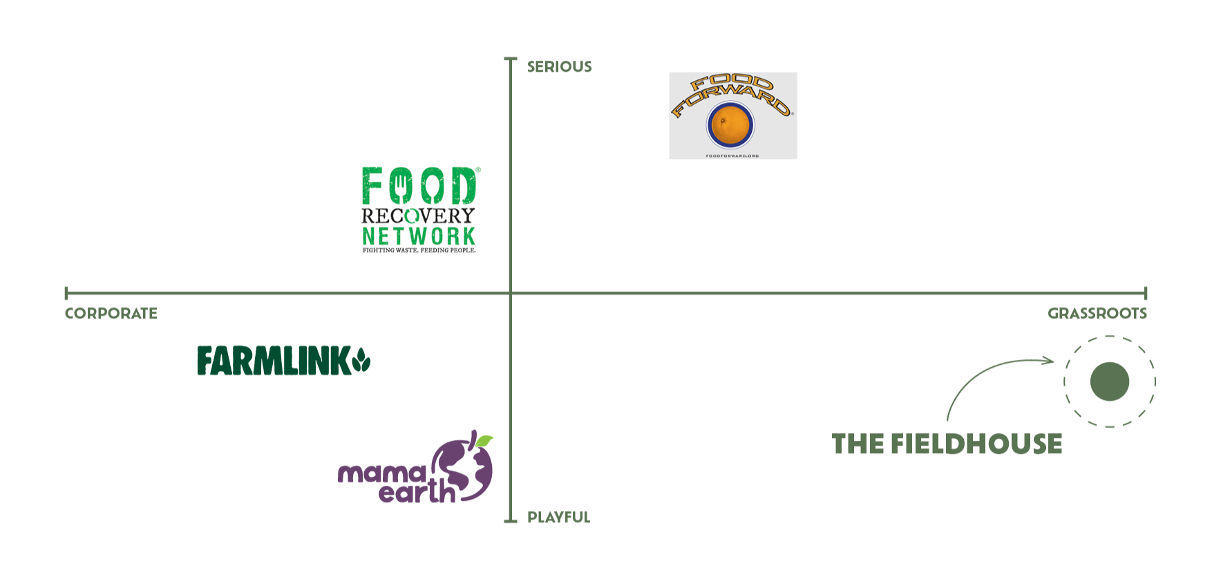
Key Terms:Approachable, educational, playful, youthful + witty
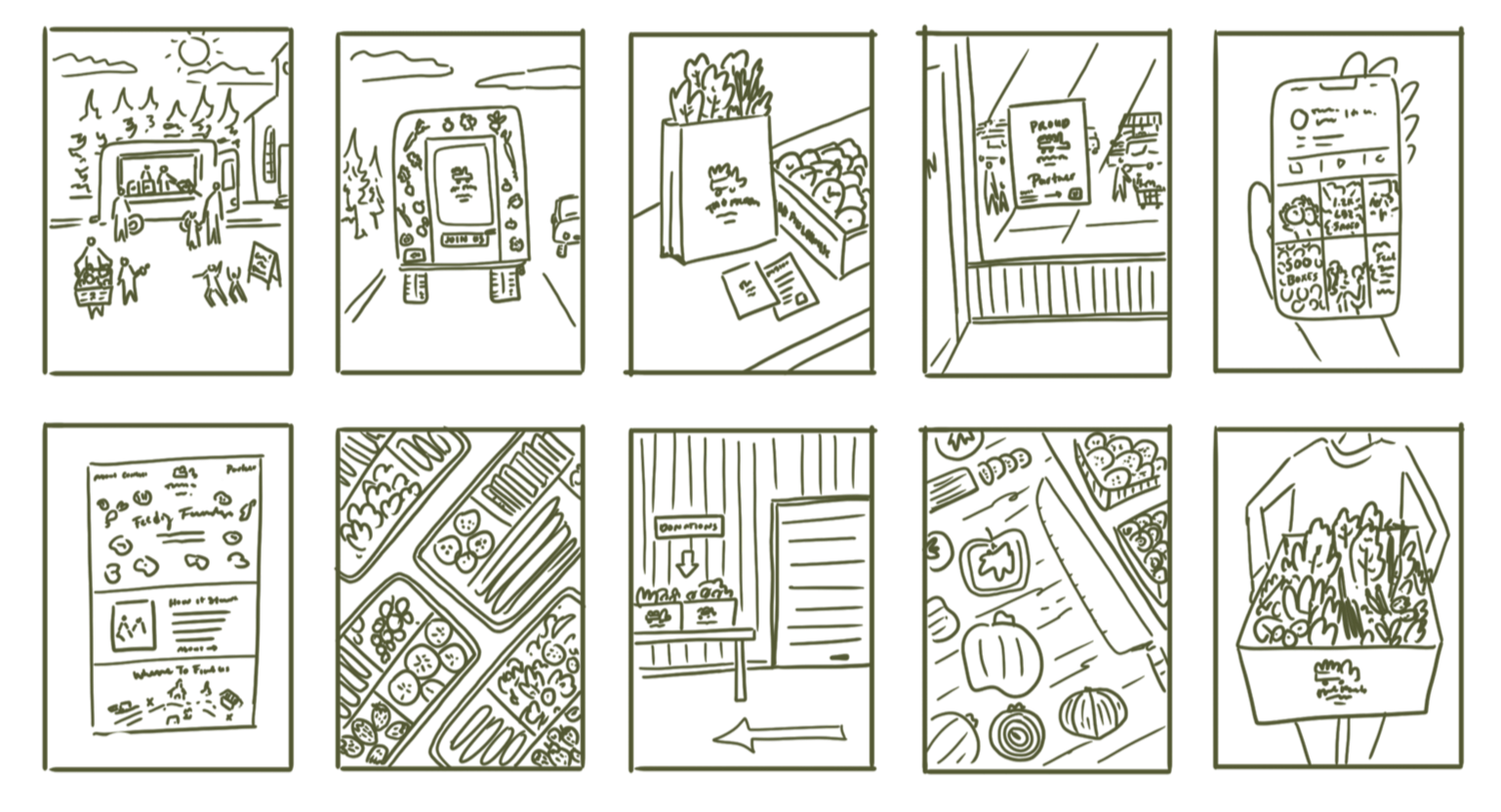
brand moments:A set of quick illustrations, or “brand vignettes” that study how The Fieldhouse will show up in everyday moments. These sketches allow us to visualize how the brand is experienced to begin exploring the tone, personality and assets to develop down the line.
From here, we discovered three through-line motifs; freshness, mobility and community. These became the foundation for the visual identity.
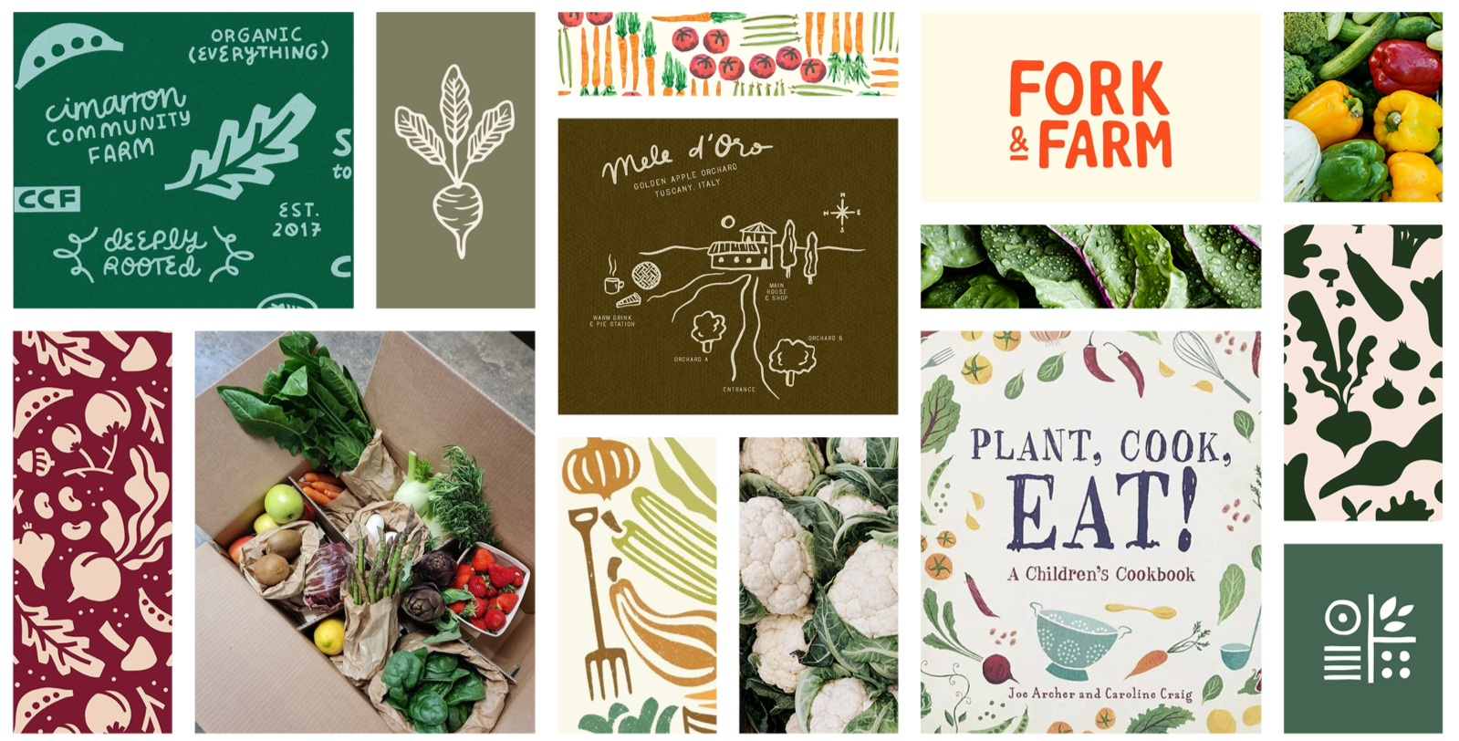
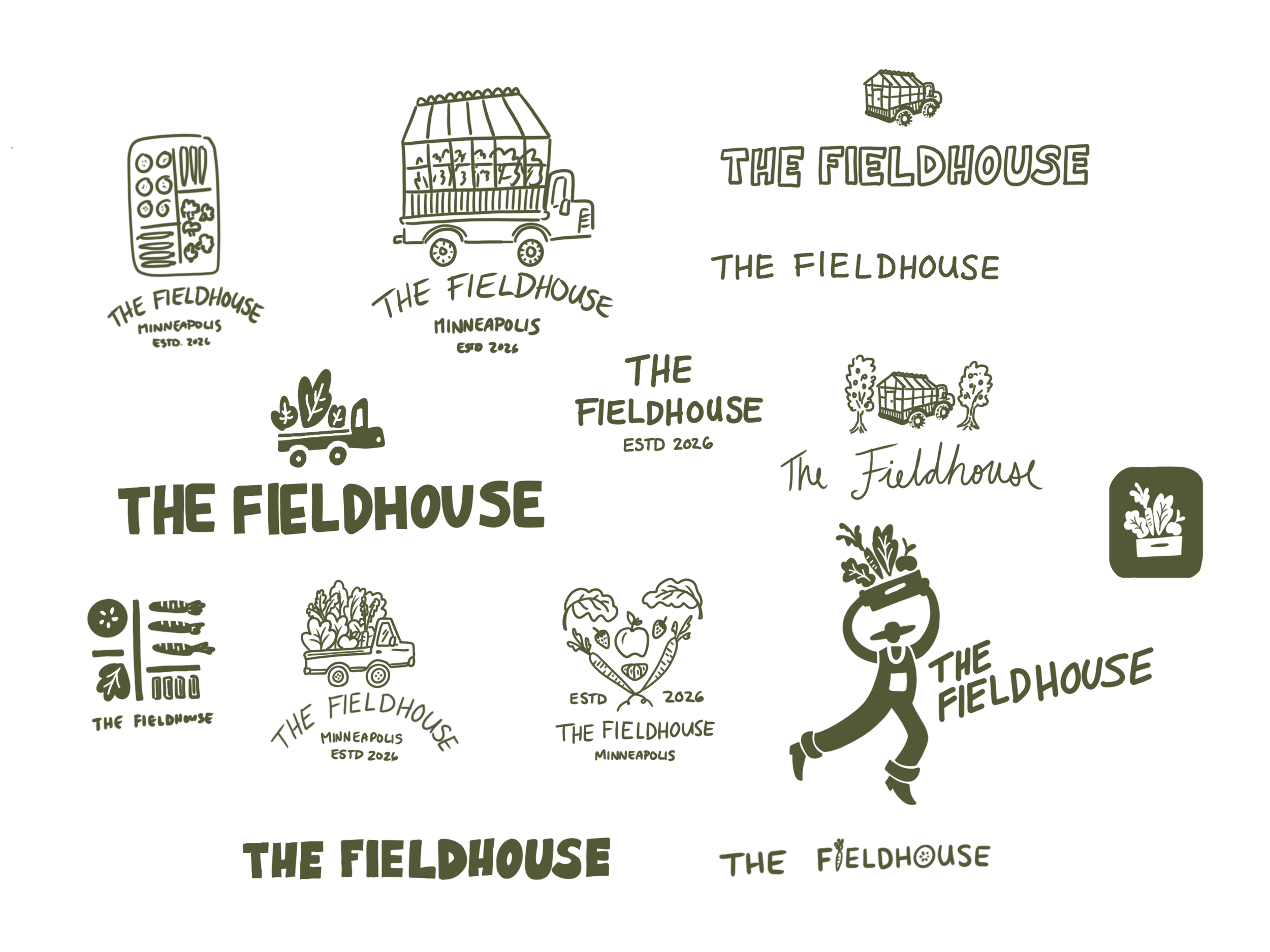
Moodboard + sketches:The moodboard set the tone for the brand’s visual style whereas the initial logo sketches explored various expressions for The Fieldhouse’s branding. Here we tested different ways of communicating the core motifs through graphic form, iconography and typography.
Step three: developbrand identity
For The Fieldhouse’s brand identity, we worked collaboratively to design the brand across all fronts, from the visual identity to the brand’s communications.
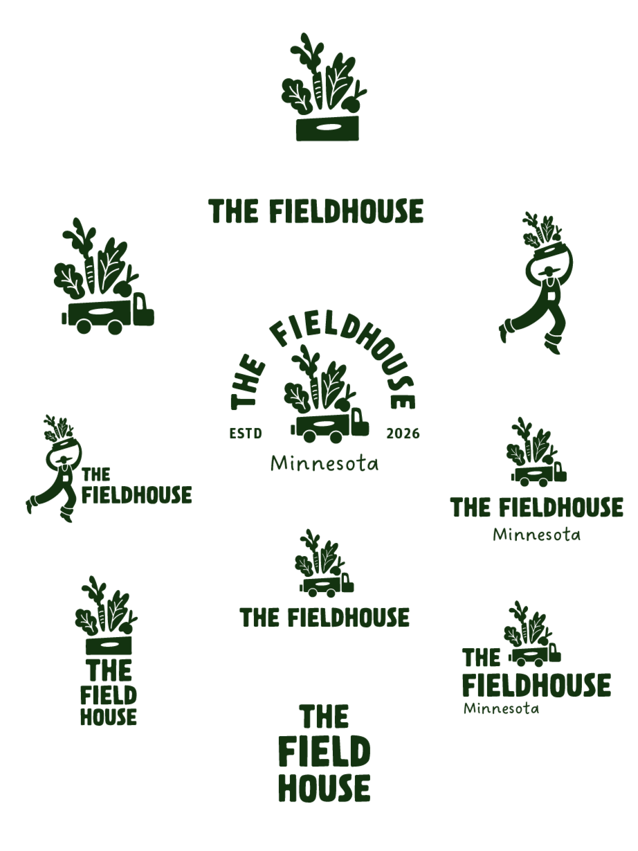
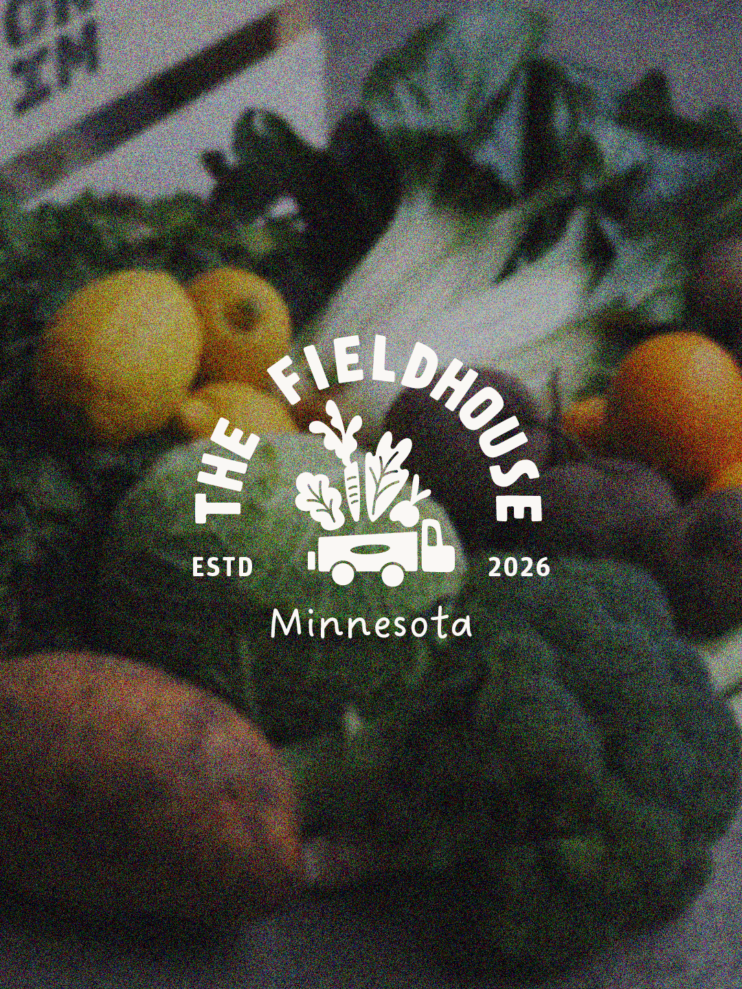
One icon - three meanings
Suppliers
The growers, grocers, and food suppliers who give excess fresh produce a second chance through their donations.
Local Hosts
From farms to parking lots to congregations, hosts provide welcoming places where food can land and people can gather.
Neighbours
The people at the heart of the mission. Neighbours show up, share stories, and bring these boxes to life in their kitchens and homes.